How To Analyze Your High Traffic Pages For Better Conversions & Improve Bounce Rates. (With examples)
Written by: Ryan Johnson

I perform website reviews using heuristic analysis. It’s a structured experienced based analysis of a website. It’s the same as an experienced mechanic knowing what's wrong with your car by looking at it. In the same way a conversion analyst can look at your website and tell you what could improve.
First we’ll map out the pages/steps it takes to complete the goal we’re optimizing for. Then assess each page in the funnel and answer these main questions:
- Do the pages load fast enough?
- Is the offer and how it works clear and understandable?
- Are there any elements on the page distracting visitors from the main goal?
- Does the landing page relate to what the visitor thought they were going to see?
- Is the copy clear or confusing?
- Is it easy for users to navigate through the site and know what they need to do?
- Are forms easy to use?
- Do users encounter error messages that confuse or deter them?
Disclaimer:
- This is not a thorough analysis of the site. It's a quick review of the homepage to help you learn how to analyze your high traffic pages.
- This feedback is an educated opinion with experience optimizing sites.
An example of how to analyze an ecommerce store (petco.com).
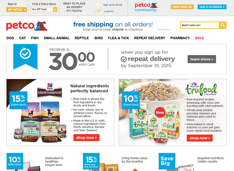
I picked a random website for pet supplies (petco.com). We need a goal to optimize towards for this example. Looking at the homepage I would guess that their goal is for people to buy with repeat delivery.
Here’s their homepage critique on optimizing for people to buy with repeat delivery.
- The homepage is lacking a clear value proposition. Why should I buy from you instead of your competitors? Because of their large social media following they could use social proof or start with their why .
- Make the main goal more prominent in the visual hierarchy. The three main boxes (repeat delivery and food offers) are competing for my attention.
- They don’t answer some top questions on how and why new visitors should get repeat delivery. I found the benefits after adding a product for repeat delivery.
- The call-to-action labels aren’t clear on what will happen next. For example “Learn more” compared to “Learn how repeat deliveries can save you money”.
- Learn more about repeat deliveries isn't relevant. Because not only does it not give that much more info but it doesn’t sell me at all on repeat deliveries.
- Increase clarity and relevancy on buttons. “Shop Now” isn’t a great call-to-action. It should be relevant to what they’ll see next. For example “Get natural ingredient pet food” and “Get whole nutrient rich pet food”.
- Questions that could come up when selling repeat deliveries: How do I know how many bags I need per month? What if I start having too many bags at home and want to delay the next one? How many more steps to create a recurring order? Is this more of a hassle? Do you get an email before it ships so I cancel/delay the next shipment?
An example of how to analyze a lead-gen site. (statefarm.com)
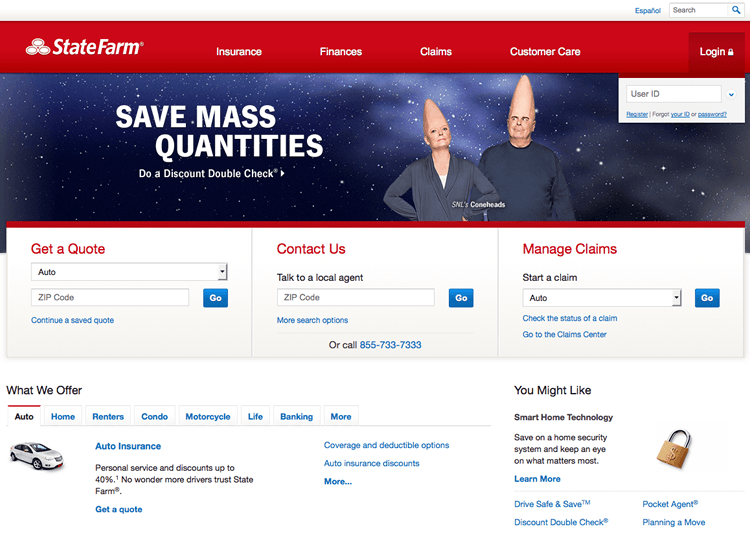
State Farm's main goal is to get leads through insurance quotes. Below is their homepage review using the process I use at the top of this article.
- No clear value proposition. The main headline makes no sense. If I came into their office and said “Why should I buy insurance from you?” and they replied with the words from their headline “Save mass quantities. Do a discount double check.” I’d blink in confusion and be out the door. This is what they’re doing with their website.
- The call-to-action buttons “Go” are vague and don’t give me an idea on what will happen next. Label your buttons with what people will get when they click it.
- Make “Get a quote” or one of the other three more prominent. Check the analytics to see what people do most on the site.
- The copy (or lack of) needs some work. How do I benefit from using your services? How is it better or different from the competition? Why do people trust you?
- Reduce anxiety. How long will the quote take? How long do claims take to go through? What’s the service like after I pay? Always state your claims with proof.
- There’s nothing that urges the visitor to get a quote now. Increase urgency with your offer.
- There’s not enough information on the page to make a decision. Try selling someone insurance using only the words they have on their webpage.
- The coneheads aren’t relevant to getting insurance and causes confusion.